No edit summary |
m Niko moved page Template:Inline Tooltip Hover to Template:CoE Tooltip Hover: Renamed to depict CoE styling |
(No difference)
| |
Revision as of 07:58, 25 September 2023
CoE Tooltip Hover
Inserts text that has an image display on mouse hover, inline with other article text. Uses the specified CoE Style.
- Types
- tooltip-short : Intended for image HEIGHT less than 150px
- tooltip : Intended for image HEIGHT between 150px and 250px
- tooltip-long : Intended for image HEIGHT between 250px and 500px
Note: There is no tooltip type for tooltip images that with more than 500px height. The tooltip image will not be completely above the tooltip text in this case.
- Styles
- item-title : Standard Item/Ability/Status title
- item-subtitle : Standard subtitle (sub-classes, etc.)
- item-text : Standard description
Usage
{{CoE Tooltip Hover
|type = [tooltip-short] or [tooltip] or [tooltip-long] defaults to tooltip if no class is included
|style = [class from CoE Styles Template] defaults to item-text if no class is included
|pre-inline-text = [text that goes before the tooltip] OPTIONAL
|hover-text = [text that the tooltip defines]
|post-inline-text = [text that goes after the tooltip] OPTIONAL
|image = [tooltip image file name]
}}
Example Usage
<span>Grants
{{Inline Tooltip Hover
|pre-inline-text = Grants
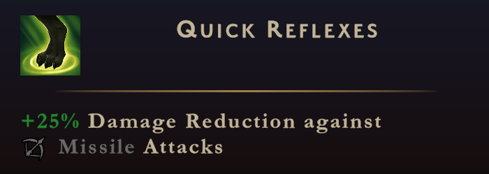
|text = Quick Reflexes
|post-inline-text = .
|image = Image:SF CoE Ability Quick Reflexes.png
}}
</span>
Example Preview


