No edit summary |
No edit summary |
||
| Line 110: | Line 110: | ||
''Note: There is no tooltip type for tooltip images that with more than 500px height. The tooltip image will not be completely above the tooltip text in this case.'' | ''Note: There is no tooltip type for tooltip images that with more than 500px height. The tooltip image will not be completely above the tooltip text in this case.'' | ||
<div style="color:red;font-size:125%;background-color:pink;">If you want the text inline (as shown in example) you MUST use <nowiki><span> and </span></nowiki> at the start and end of the section that uses the tooltip (shown in the Example Usage section).</div> | |||
==Usage== | ==Usage== | ||
| Line 125: | Line 127: | ||
==Example Usage== | ==Example Usage== | ||
<nowiki><span></nowiki>Grants | |||
<nowiki> | <nowiki> | ||
{{TooltipHover | {{TooltipHover | ||
| Line 133: | Line 136: | ||
</nowiki><br><nowiki> | </nowiki><br><nowiki> | ||
}} | }} | ||
</span> | |||
</nowiki> | </nowiki> | ||
==Example Preview== | ==Example Preview== | ||
<div | <span>Grants <div class="tooltip-short"><b>Quick Reflexes<span style="margin: 5px; display: block;height: auto; max-width: 250px;" border="0">[[Image:SF CoE Ability Quick Reflexes.png]]</span></b></div></span> | ||
| Line 143: | Line 147: | ||
<div | <div class="{{{type|tooltip}}}"><b>{{{text|tooltip}}}<span style="margin: 5px; display: block;height: auto; max-width: 250px;" border="0">[[{{{image|File:NoImage.png}}}]]</span></b></div> | ||
Revision as of 07:14, 25 September 2023
TooltipHover
Inserts text that has an image display on mouse hover.
- Types
- tooltip-short : Intended for image HEIGHT less than 150px
- tooltip : Intended for image HEIGHT between 150px and 250px
- tooltip-long : Intended for image HEIGHT between 250px and 500px
Note: There is no tooltip type for tooltip images that with more than 500px height. The tooltip image will not be completely above the tooltip text in this case.
If you want the text inline (as shown in example) you MUST use <span> and </span> at the start and end of the section that uses the tooltip (shown in the Example Usage section).
Usage
{{TooltipHover
|type = [tooltip-short] or [tooltip] or [tooltip-long] defaults to tooltip if no class is included
|text = [text that the tooltip defines]
|image = [tooltip image file name]
}}
Example Usage
<span>Grants
{{TooltipHover
|text = Quick Reflexes
|image = Image:SF CoE Ability Quick Reflexes.png
}}
</span>
Example Preview
GrantsQuick Reflexes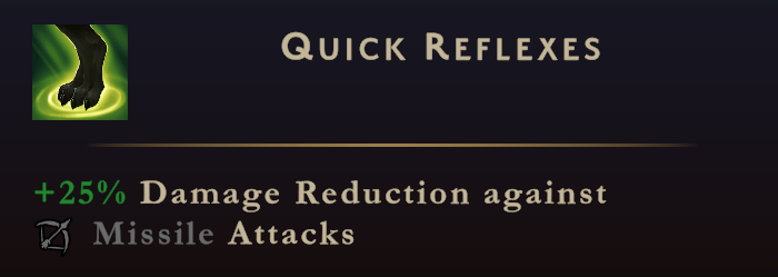

Template Markup
tooltip