No edit summary |
m Niko moved page Template:TooltipHover to Template:Tooltip Hover: Added space between Tooltip and Hover |
||
| (27 intermediate revisions by the same user not shown) | |||
| Line 1: | Line 1: | ||
{{#css: | |||
.tooltip-short, .tooltip, .tooltip-long { | |||
position: relative; | |||
-webkit-transition: all 0.3s ease-in-out 0s; | |||
transition: all 0.3s ease-in-out 0s; | |||
display: inline-block; | |||
color: #07f; | |||
} | |||
.tooltip-short:hover, .tooltip:hover, .tooltip-long:hover { | |||
color: #fff!important; | |||
cursor: pointer; | |||
} | |||
.tooltip-short a { | |||
position: absolute; | |||
display: block; | |||
visibility: hidden; | |||
opacity: 0; | |||
transition: all .3s; | |||
border-radius: 5px; | |||
box-shadow: 0 0 20px #444 inset; | |||
padding: 3px 5px 3px 5px; | |||
top: -150px; | |||
left: -5px; | |||
z-index: 9999999; | |||
border: 1px solid #514d4d; | |||
} | |||
.tooltip a { | |||
position: absolute; | |||
display: block; | |||
visibility: hidden; | |||
opacity: 0; | |||
transition: all .3s; | |||
border-radius: 5px; | |||
box-shadow: 0 0 20px #444 inset; | |||
padding: 3px 5px 3px 5px; | |||
top: -250px; | |||
left: -5px; | |||
z-index: 9999999; | |||
border: 1px solid #514d4d; | |||
} | |||
.tooltip-long a{ | |||
position: absolute; | |||
display: block; | |||
visibility: hidden; | |||
opacity: 0; | |||
transition: all .3s; | |||
border-radius: 5px; | |||
box-shadow: 0 0 20px #444 inset; | |||
padding: 3px 5px 3px 5px; | |||
top: -500px; | |||
left: -5px; | |||
z-index: 9999999; | |||
border: 1px solid #514d4d; | |||
} | |||
.tooltip-short a img, .tooltip a img, .tooltip-long a img { | |||
display: block; | |||
border: 1px solid #444; | |||
max-width: 360px; | |||
height: auto; | |||
} | |||
.tooltip-short a:after, .tooltip a:after, .tooltip-long a:after { | |||
content: " "; | |||
border-style: solid; | |||
border-width: 7px 7px 0px 7px; | |||
border-color: rgba(55, 64, 70, 0.5) transparent transparent transparent; | |||
transition-duration: 0s; | |||
transform-origin: top; | |||
transform: translateX(-50%) scaleY(1); | |||
position: absolute; | |||
left: 5%; | |||
bottom: -7px; | |||
} | |||
.tooltip-short:hover a, .tooltip:hover a, .tooltip-long:hover a{ | |||
visibility: visible; | |||
opacity: 1; | |||
} | |||
.tooltip b:before, .tooltip b:before, .tooltip-long b:before { | |||
content: ""; | |||
position: absolute; | |||
width: 100%; | |||
height: 2px; | |||
bottom: 0; | |||
left: 0; | |||
background-color: #333; | |||
visibility: hidden; | |||
-webkit-transform: scaleX(0); | |||
transform: scaleX(0); | |||
-webkit-transition: all 0.3s ease-in-out 0s; | |||
transition: all 0.3s ease-in-out 0s; | |||
} | |||
.tooltip-short b:hover:before, .tooltip b:hover:before, .tooltip-long b:hover:before { | |||
visibility: visible; | |||
background-color: #0c96ff!important; | |||
-webkit-transform: scaleX(1); | |||
transform: scaleX(1); | |||
} | |||
}} | |||
<div style=" | <noinclude> | ||
==Tooltip Hover== | |||
Inserts text that has an image display on mouse hover. | |||
;Types: | |||
:tooltip-short : Intended for image HEIGHT less than 150px</li> | |||
:tooltip : Intended for image HEIGHT between 150px and 250px</li> | |||
:tooltip-long : Intended for image HEIGHT between 250px and 500px</li> | |||
''Note: There is no tooltip type for tooltip images that with more than 500px height. The tooltip image will not be completely above the tooltip text in this case.'' | |||
===Usage=== | |||
<nowiki> | |||
{{Tooltip Hover | |||
</nowiki><br><nowiki> | |||
|type = [tooltip-short] or [tooltip] or [tooltip-long] </nowiki>''defaults to tooltip if no class is included''<nowiki> | |||
</nowiki><br><nowiki> | |||
|text = [text that the tooltip defines] | |||
</nowiki><br><nowiki> | |||
|image = [tooltip image file name] | |||
</nowiki><br><nowiki> | |||
}} | |||
</nowiki> | |||
===Example Usage=== | |||
<nowiki> | |||
{{Tooltip Hover | |||
</nowiki><br><nowiki> | |||
|text = Quick Reflexes | |||
</nowiki><br><nowiki> | |||
|image = Image:SF CoE Ability Quick Reflexes.png | |||
</nowiki><br><nowiki> | |||
}} | |||
</nowiki> | |||
===Example Preview=== | |||
<div class="tooltip-short"><b>Quick Reflexes<span style="margin: 5px; display: block;height: auto; max-width: 250px;" border="0">[[Image:SF CoE Ability Quick Reflexes.png]]</span></b></div> | |||
==Template Markup== | |||
</noinclude> | |||
<div class="{{{type|tooltip}}}"><b>{{{text|tooltip}}}<span style="margin: 5px; display: block;height: auto; max-width: 250px;" border="0">[[{{{image|File:NoImage.png}}}]]</span></b></div> | |||
Latest revision as of 07:37, 25 September 2023
Tooltip Hover
Inserts text that has an image display on mouse hover.
- Types
- tooltip-short : Intended for image HEIGHT less than 150px
- tooltip : Intended for image HEIGHT between 150px and 250px
- tooltip-long : Intended for image HEIGHT between 250px and 500px
Note: There is no tooltip type for tooltip images that with more than 500px height. The tooltip image will not be completely above the tooltip text in this case.
Usage
{{Tooltip Hover
|type = [tooltip-short] or [tooltip] or [tooltip-long] defaults to tooltip if no class is included
|text = [text that the tooltip defines]
|image = [tooltip image file name]
}}
Example Usage
{{Tooltip Hover
|text = Quick Reflexes
|image = Image:SF CoE Ability Quick Reflexes.png
}}
Example Preview
Quick Reflexes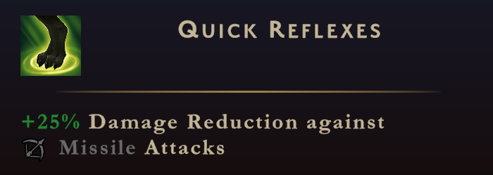

Template Markup
tooltip